Saturday, October 24, 2020

Tom Sawyer Batch 2

 Last post I talked about the help I got from my team and the trust that needed to be established with the writers and art directors. I mentioned that over the course of the next six batches, I found ways to fit my detailed, realistic style into scope, but didn't really show examples. That's because batch #2 was when I started to do a much better job of managing complex vs. simple, and implied vs. described. 


Here's a perfect example of simplifying and compromise. This is an image illustrating the first time Tom and Huck meet to make a trade, Tom trading his tooth for Huck's 'first of the season' tick. He also has a dead rat. I wanted to just have Huck in the scene, considering how thin the composition was, and completely forego a background. But the authors wanted Tom in the picture, and if Tom was there, it needed a background.


In the color phase, I added Tom into the image, and the direction was two-fold: give Tom a hat, and silo the image. In other words, fade the edges of the illustration out so there were no hard corners.


I focused on Huck, especially on his hands and face, and Tom's hand. Everything else was extremely expressionistic. This helped highlight the important parts of the image and, more importantly, bought me precious time for the other four images in this batch. 

That precious time was eaten up when other images went through multiple revisions. 


Tom and Becky flirting was a strangely difficult piece to get right. 


From sketch to color study to final revisions, it took a while to nail down everything this scene needed to show: the text on the slate, their flirting interactions, and the school house setting. 


Between the time I had and the needs of the book, something had to give. I simply couldn't add a whole classroom and children at the same fidelity as Tom and Becky within the deadline. And so, again, we found a design-forward compromise.


I think it's time to talk about the compositions of my work for this project. If you know my work, you know I kind of love a dutch angle. At the very least, I like to add perspective. For most of the paintings in this project, especially early on, there were two considerations I had to keep in mind: the first was expectations of the authors, the second was, of course, timeline. 

Fair or not, I came into the project with my own biases, and kept my early submissions extremely straightforward. Literally. The main characters where always center composition, horizon line was almost always in the middle of the page, and any architectural elements where always straight-on. This makes for more stagnate images, but it's also a lot faster to design and complete. I wasn't sure if the authors would be interested in more challenging designs, and it took a few batches of them seeing my work, and the consistency of my finals, for both of us to feel comfortable with more daring compositions.

There were early exceptions, however.


Even this example has the house in the background straight up and down. I was still hesitant to angle the roof too much in the foreground to enhance the perspective. Also, it's kind of amazing the conversations you get into about facial expressions. How do you show excitement but not outright happiness? Anticipation? 

Anger, surprise and fear are much easier, however!


This was the first piece where I really tried to mix up the formula. How do you fit five figures into a half-page and make all of their facial expressions readable? The expressionistic background for Huck, the woodgrain silo for Tom and Becky, the flat house-front for Tom's escape, all of those little time savers were made specifically to give me space for this piece. In most batches I had one or two stand-out images that I would spend more time on to really convey the importance of the moment in the story. 


Tom and Huckleberry do a lot of night time adventures and running away! I'll talk more about this one in the context of a later illustration. But in many ways I feel like this was the first draft of a later, better painting. 

At this point in the schedule, I'm working on three batches at once! There was no room to breathe, especially when the deadlines would overlap one another. It's in batch #3 when we'll see that pressure start to creep up on the deadlines as I look for extra production days anywhere I can find them.

Friday, October 23, 2020

Tom Sawyer Batch 1

 Let's start back at the beginning. 

This post is for those new to illustration or just curious about how the process works. I'll be sharing how I tackled a job of this size: the things I did to work within scope (ie: finding the right balance between 'Sistine Chapel' and 'children's crayon drawing'), and the steps from start to finish on individual illustrations. 

The first part of any project is building trust with your partners. In my case, I had two parties involved: MD (media designers, basically art directors) and AD (academic designers, content writers). I worked directly with the MD, who would route art requests (called specs) to me. When I had art to submit, they would send it to the ADs to critique and approve, then back to me, so on and so forth. 

Early on, AD had no idea what to expect from me when it came to final images. That trust had to be built, and especially with such a big project, the early stages were hard going. I know when parts of my sketches are just placeholders, but they don't. So sometimes during the sketch phase in the early parts of Tom Sawyer I would get asked to change major parts of the image because they weren't sure where I was going with it. 

For instance, when I sent them the first batch of illustrations, they didn't understand the halftones, thinking I had sent them final illustrations. "No, we wanted full color illustrations, these look too serious!"


Similarly, it took me time to learn exactly what they wanted. You'll see my work become looser and more comfortable as the project continued and we started to trust each other's visions.

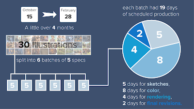
This project was massive, 30 images overall, and the timeline was very small. Any freelancer knows that deadlines shift wildly depending on the project. I've known artists to have 24 hours to complete a piece, and I've personally gotten a cushy two months for one image before, but this timeline was four months for 30 images. That's sketches, color studies, photo shoots, and final rendering in 92 business days, or about 3 days per piece. Not ideal. 

But, prospective illustrators, you get hired to be visual problem solvers. Sometimes that problem is 'make my book character attractive and energetic.' Sometimes that problem is 'figure out how to make 30 illustrations in sixteen weeks.' 

Part of the challenge of creating so many images, especially fully rendered painterly images, is getting the right amount of detail without getting bogged down, or worse, making an image look inconsistent. With five images in every batch, time spent on one image would take from another, so it was constant triage. I learned a lot in a very short period of time about where I needed to concentrate my efforts.

I had a hidden weapon when it came to tackling this colossal task: I work in-house at McGraw Hill. That means that the book budget was my budget (as long as I didn't ask for too much!), so I was able to hire models and use a dedicated studio space for reference. I also rented costumes. :)


The MDs I worked with were in the same building so they were able to schedule shoot times and align them with project deadlines. That means on Monday I get specs, make quick composition sketches, Wednesday I shoot reference, and by Friday I have finalized sketches ready for color. This does put me at risk, and there were a few times I had to reshoot reference because they didn't like my initial composition, but overall this tactic worked nicely.

It was a big deal to have the help of a team while I picked away at this project. I also work with other illustrators so I could always lean over and ask for advice if I ever got stuck on a visual problem.

In my last post, I showed the steps that were scheduled for each spec, and the deadlines for them. 5 days for sketches, 8 for color, 4 for rendering, and 2 for revisions. This schedule was set up for artists who don't render nearly as much as I do, so I would usually take some of those 8 days for color and render instead. 

This piece, for instance, took eight hours to render (minus revisions). Getting simpler images out of the way quickly helped pave the way for multiple full figure illustrations later down the road! After all, for batch #1, I actually had 5 more illustrations due after this one!

Here comes the boring part: I had to stay super organized. in the end, I had over 500 reference photos and every _revision, _revision_02, _revision_03_recovered file to keep track of across files across batches. It pays to set up an easy to navigate file system, regardless of how big your project may be. That desktop will become a black hole and suck every half-finished project you've ever made into the ether.


Boring part done, let's look at the rest of the illustrations!


In the end, after all the help and the trust and the scheduling, the only thing that kept my work sharp and on target was reference. Good, solid reference. If it were up to me, I would have traveled to Mark Twain's boyhood home in Missouri and taken all the pictures I could, but alas, 'what if we used our vacation to shoot reference for my work' wasn't a great sales pitch. The fact that I was able to find excellent kid models and schedule a shoot for every batch was a life saver. 

Looking back on this first batch, I can see the places where I was still unsure, still building confidence in myself and a truncated production schedule, and still building confidence with my partners. As time went on, and the asks got bigger, I found a rhythm to the work and a better instinct for what details could go and which were needed to sell the image.


Thursday, October 22, 2020

Illustrating Tom Sawyer


Some very exciting news I've been sitting on for a while: I got to illustrate Tom Sawyer for McGraw Hill Education! It's included in their 2021 Reading Mastery Transformations K-5 program, which is a reading intervention program. You know what's crazy about that? I was in a reading intervention program for a short time in fifth grade, where I read a part of Tom Sawyer and illustrated it for an assignment! I still remember drawing the wood grain on the pulpit in a church scene.


30 illustrations, 92 business days, over 500 reference photos, and close to 1000 hours of painting and drawing. Every photo and sketch and final psd stacked together weighs 13.8 gigabytes. This was the most challenging (and fun) project I've ever worked on. 


Each batch of illustrations would release every two weeks, and there were reviews scheduled after every step. Once I finished sketches, for instance, I would have to wait for the review. The feedback on those images would come in the middle of the sketch phase for batch two, but instead of pushing deadlines out, they would layer over each other. Some weeks had me working on three batches at once! There were three things that got me across the finish line: reference, a very regimented schedule, and my team at McGraw Hill. Among other things, my manager bought precious days late in the project, and Max Yeager, a fellow illustrator, jumped on to complete six illustrations in the home stretch when everything really stacked up. 


Tom, Huck, and Becky were professional child models. They were great! The rest of the players you see here were coworkers (remember when I said I couldn't do it without them?). Man, I miss being in the office with my friends.


So let's show some actual work, yeah? 


Sketch to block in composition so I can shoot reference.


Final sketch for review.


Color blocking.


Final.

I'll be sharing finals and some process shots over the next few days, I hope you enjoy the work!


Two more just because I like them so much: