Alright, it’s time I threw my voice out there in all this mess.
AI art. Should we fear it? Ban it? Embrace it? I’ve gone back and forth from curiosity to fear, anger and hope, and everywhere in between. I’m still not fully concluded on what I think about AI art, but I do have thoughts. Do feel free to add your own, if you’re so inclined.
First and foremost, apps like Lensa are scraping artist’s personal work without their knowledge or intent. That’s just blatantly wrong. Probably legally so. Garbled signatures appear in so-called “original” AI conceptions, on what is essentially a Photoshop filter app that just rips styles wholesale out of an unsuspecting artist’s social presence. I’m not blaming you for doing a thing that’s fun if you jumped on the bandwagon, but moving forward, I’d exercise caution, first for the sake of the artists in question, and second for the data that you’re giving these companies. That, I think, sets up the structure of this conversation.
Let’s look at this sticky wicket on two fronts: First, commercial art. What effect does AI have on this market, and why should I care? Second, the implications for images, both illustrative and photographic moving forward.
Devil’s advocate says: AI is just a program doin what humans do, learning from their styles and replicating them, you learned by imitation too. This is a Bad Take. Let’s say I learn to be the cheap version of, I don’t know, James Jean. He’s a big, super busy, super talented artist. He no longer takes some commissions because they simply can’t afford him, especially since he can afford to do whatever interests him. Let’s say I’m a successful imitation, and I take, I don’t know, thirty to forty projects a year. I do not take two thousand projects. I do not produce millions of prompts. I do not replace thousands of artists at fifteen dollars a month.
Devil’s advocate says: AI helps even the playing field! It democratizes art! This is an Okay take. But herein lies the problem: the creative field is not one where we’re all drinking champagne and pooping gold. The ability to make art for oneself versus license art at scale reduces an already undervalued creative commodity to almost zero.
The Devil responds: Well you’re just John Henry breaking his heart pounding railroad nails! Why fight for back breaking labor? Rendering is dead, now we can push ourselves to new creative heights by making AI do all the busy work! This is a Very Bad Take. I, and most of the creatives who stay in the field, fall in love with so many aspects of the work; the craft; the moment to moment decisions of line, brushwork, and color. This is a job I love, and it can be hard work, but it’s fulfilling work. It’s meaningful. Reducing the hard stuff to a prompt, removing those moments of euphoric flow in service to an end product is missing what makes art, art. I’d rather do something else if being a so-called artist meant milking an AI for images to stitch together.
Devil’s Advocate says: Cat’s out of the bag. AI is here to stay and you either get out or adapt. This is the Worst Take. It’s also probably the most realistic. But I’m fucking tired of spending decades worshipping big tech pretending it hasn’t brought us closer and closer to social and financial ruin.
I remember having conversations in the early 2000’s about the blue-sky possibilities of social media, ‘back when Facebook was hip.’ There was so much positivity about how truth could blossom, lies and manipulations would wilt in the light of constant information. It sounds so stupid now, doesn’t it? You want to know why social media leads to conflict?
The incentives are all about profit. There’s no commitment to bettering society, or being a common good. It’s either a product, or you are. Is it free? Then you’re being used. And the way they use you is to push outrage, foster division, and amplify conflict. Because ads need eyeballs, and the only numbers they can run are engagement, and humans engage most when they’re excited. Excited by fear, anger, and resentment. If social media were a public good, the experience would be entirely different. But it isn’t. And neither is AI. AI is poised to destroy livelihoods, and for what? Progress?
Some fucking capitalist with no respect or understanding of creativity scrapes the pixels of thousands of artists and uses the language of inclusivity and positivity to sell us our own roasted fingers? I’m sorry, but I’ve heard this song before.
“Cat’s out of the bag!” WE built the cat. WE sewed the bag. We’re allowed to put it back. The only reason we won’t is because corporations have spent years pushing us under and saying, “what can we do?”
Oh, privacy doesn’t exist anymore. Sure, but what could we do? It’s not like our own inability to protect your data, or in some cases our craven selling of your data, or in some cases the blatant psychological testing of your data is our fault. Bullshit. They’re not inevitable, and I’m tired of pretending they are.
“Gosh, sure wish the companies that gave us all nice new boats to ride out the rising sea level didn’t also put bombs in them, but hey, can’t put the toothpaste back in the tube.” I’m so tired of this apathetic, nihilistic, bullshit response to a complete abdication by our government from protecting our rights.
Having said all that, it’s very possible that this AI runs into the same problems as self-driving cars: computers aren’t good for actual split second decision-making or inspiration. Artists were never going to make money off of people getting custom Facebook profile pics. No one really wants to make that children’s book their friend’s aunt has been thinking about for ages. No, I don’t want to design your tattoo. And any CEO who thinks they can just get really good at prompts and no longer has to hire a middle man to create work for them might quickly realize how much effort image curation still takes, even when the computer does 90% of the work.
I think there will be a stratification of who comes to AI and why, and there will always be some percentage of need for high-quality, specific art. But the value of that art may continue to drop, to the point where you’d have to use AI to make any kind of profit. And maybe this makes me an old man, but the value of my art comes not from how fast I can make it, but the honing of my craft and my ideas. I take pride in being an illustration professional, which is already an endangered profession. I wasn’t interested in fine art because I like to solve problems with my images, to tell other’s stories and to be a part of enriching the experience of people who would happen upon my work in any of its venues. If that version of illustration dies, my career as an illustrator may die with it, not because I’m unwilling to adapt, but because the market became inhospitable to human expression, timescales, and values.
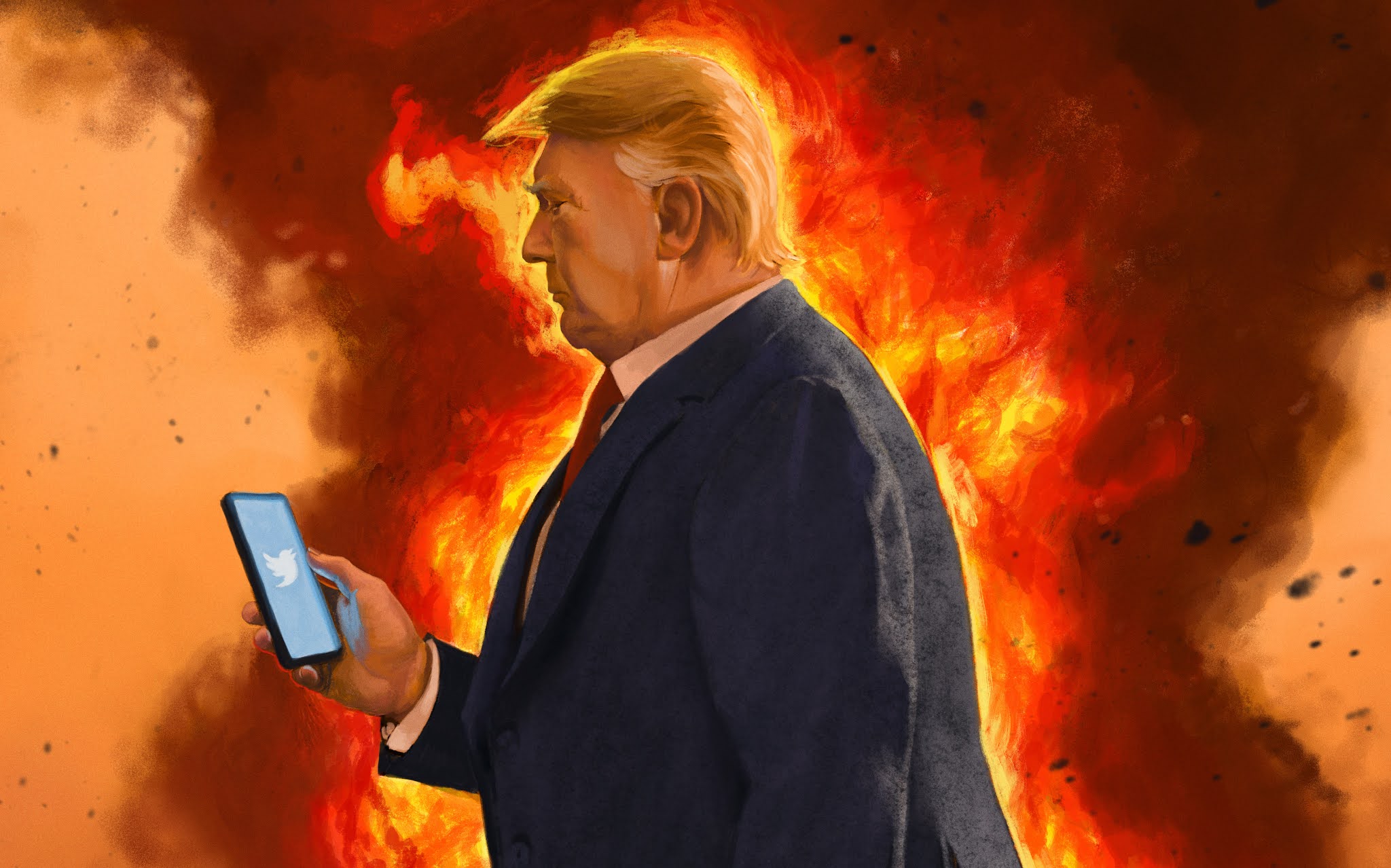
Finally, on the implications of these programs for the future of our privacy and the already fractured shared reality of our society: I’m not going to put on a tin foil hat here, but these programs are very good at making things look real as well as illustrated. Photographic manipulation of images, when prompted by sick minds, can get very troubling very quickly. This thing isn’t a tool. It’s a gun. And I know Americans have a tough time wishing for gun regulation, but I think we recognize that a gun is as dangerous as its user. I hope you understand, without me having to say, what someone could do with photos of you or people you know at ANY AGE with this kind of software. Consider those implications. I don’t think I’m off base for calling for an early, aggressive legal and regulatory approach to guiding this technology.
Thursday, December 15, 2022
Wednesday, October 20, 2021
Happy Hallow's Eve!
I wanted to make a little spooky pin-up for halloween, so here it is! I've had a lot of fun and exciting projects lately that I can't talk about yet, but until then, enjoy some spookiness!

Tuesday, June 8, 2021
The Election of 2016 and 2020
What seems like forever ago, in the innocent way way back times of 2016, I made a poster about the presidential election. It was in the style of Drew Struzan, who popularized the movie poster design of putting a bunch of faces and scenes into a montage. Think of the poster for Big Trouble in Little China, or The Goonies, or Indiana Jones, or if you haven't seen any of those, Stranger Things on Netflix.
If you are young, live under a rock, or have had your memory wiped by years of stress and fatigue, you might not remember what a shit-show the election of 2016 was. It was, by all accounts, pure and utter chaos. It was so entertaining that it truly felt like a movie, with plot threads and sudden reveals, twists and combatting larger than life personalities. They showed the presidential debates in movie theaters.
Bernie had a bird land on his podium. Russia was ever looming. A man jumped the fence at a Trump rally and rushed the stage. It was like nothing we'd ever seen before, even with how crazy American elections usually are. So I decided to make a movie poster for it. It'd be a good exercise in painting likenesses, and hopefully Hillary would win and I could sell some prints. It was not to be.

I wanted the title to play off of the phrase hell or high water, which is also a movie. And I wanted to be a little tongue-in-cheek. Yeah, Hillary wrapped herself in the flag, because of course she'd embrace this weird faux patriotism. And Bill holding her leg like a damsel in distress is a nice subversion of the trope. Before all the Republicans started licking Trump's boots, they were calling him a liar and a coward. Ted Cruz fought the primary all the way into the summer. Oh, how far the mighty have fallen.

Fast forward three years, and the news never stopped coming. Every week was an exhausting cascade of crisis both real and manufactured. Then the pandemic hit, the economy took a nose-dive, we were forced to work from home (if at all), and thousands died.
Oh, also there was an election coming. Unlike last time I designed the poster, where I had a tough time figuring out who and what to put into it, this time it was simple: Trump was at the center of it all. Even things he didn't cause and had no control over, he'd fight to be a part of the story. We handed a narcissist the keys to the country and gave him a megaphone and watched in fascinated horror (or awe, for his fans) as he spun like a devastating top from problem to problem. Just one of his controversies would have sunk any other politician, but he was so full of controversy it actually lifted him out of his own flood.
One week we were reading emails that showed Trump Jr. had welcomed Russian information against the opposition, the next week we were outraged about kids in cages, the next week we were reading about his lawyers paying strippers hush money to not spill the beans about his extramarital affairs. It was a happy little accident that my first "movie's" title was 'Hill or High Water,' because it was clear that we had picked high water, and we were drowning. All of us, that is, except Trump.

The only thing that I would change if I did it again is paint the Capitol Building on fire instead of the White House. Could have been a real prophet with that! I wanted to make sure I got his centaur-like stance right, and I used a few texture heavy brushes this time to really play up the traditional media look, especially in his pants and suit coat.
I put hands under his feet as if he was being held aloft by his aides. The microphones and a fully submerged reporter still trying to ask a question represented how the media ecosystem simultaneously suffered and was completely beholden to Trump. They needed Trump as much as he needed them. Every tweet was opportunity for a think piece, every interview provided days of analytical content. Every rally was broadcast with morbid fascination. And Biden was no where to be seen. When the election happened, I remember my father-in-law asked me how Biden won when there was so much clear energy for Trump at his rallies. My answer was that a lot of people didn't vote for Biden. They voted AGAINST Trump. And that's why Trump is the only person on a poster that encapsulates one of the most chaotic and unprecedented elections in modern history: because he made it so that the choice was fully black and white: vote for Trump, or vote against him.
And we did.
One more piece for good measure, because I'm not sure I ever showed it anywhere:

Not sure I like the colors, but it was an interesting experiment.
Friday, June 4, 2021
Morning Buzz
Let's talk about the most detailed, complex piece I've ever done. It's not the piece with like eight figures in a courtroom. It's not the piece with a cyborg woman crashing through a window fighting cyborg panthers. It's the picture of a grassy meadow and a salamander with a coffee and some bees.
Part of the complexity, I mean all of the complexity, comes from wanting to get the greenery right. Yeah, I could imply grass and leaves, and I did in the background, but I wanted the viewer to feel like they were in this grass. I love the look of sunlight shining through leaves, giving them this bright green/yellow glow. If I wanted to properly show those spots of sunlight, I was going to need to really pay attention to individual leaves.

I found this really beautiful, twisted, moss-covered tree on one of our hikes through Clear Creek Metro Park. It has so much life in its shape and all the things growing out of it, and I thought, you know, this would make a really lovely image. So I did a color sketch.

You can see I had a slightly different creative direction for this one early. But I felt that, as much as I love dinosaurs, we needed a better sense of mystery and discovery. Would I like to discover dinosaurs in a metro park? 100% yes. BUT how much cuter would it be to have a little salamander soaking in a warm summer morning? So I made another color sketch.
This composition would be mostly flowers and leaves in a meadow. There is this nice big tree to anchor the piece, but we need a better defined foreground, middle ground, and background. I can establish a few things by putting some giant leaves and bees in the foreground: we get a good size comparison for the tree, a bold object to help draw us into the image, and overlap to keep the perspective from flattening out.
The real challenge came not from determining the composition but filling in the leaves. These are essentially negative spaces: it's a meadow, so it is about the collection of thousands of leaves instead of individuals. But as the leaves get closer to the viewer, detailing them individually becomes more important to sell the environment. I didn't actually change the far background that much from this initial sketch. But how the hell am I going to paint leaves into the foreground without it looking like busy chaos? I'm not sure, honestly, but this is what I did.
First, I went back to the tree and shot some reference on a sunny day.

Then I outlined the spaces I needed to fill in my painting and took that shape outline over to the photo and moved it around until I liked the leaves inside of it. Then I traced the leaves in that outline and dragged the tracing back into my painting. This did two things for me: I was able to control what part of the reference I was looking at while painting, and I could control the value structure of the leaves I was painting. There were two value/color structures in the meadow, one for the shade and one for the sun. So I'd draw a shape over the sketch that represented the sun area, then take that shape and find leaves in the sun. Can you spot where I grabbed my reference?
The bees, and especially the salamander, actually took the least amount of time. I redesigned the bees to look cuter and less sinister (something about those black pointy legs creeped me out), but the salamander actually stayed exactly the same as the sketch. I was happy with this simple contented smile and his little grippy hands, things that just worked from the sketch and I didn't want to mess up that energy by overpainting him. I spent the most time holding the overall design in mind as I tackled each piece, hyper-diligent to keep colors and highlights in their place depending on whether they were in the shade or the sunlight, background, foreground, or middle ground. This determined everything from value range to detail.

Here's the starkest example, with foreground sunlight overlapping middle ground shade and background sunlight. The trees in the background needed just the right amount of detail to sell what they were, but primarily to accent the bees.

This is the part of the painting that almost drove me crazy. But once I started grabbing pieces of the reference that I liked and sort of puzzle-piecing them together, the process became much easier. If leaves were in the shade they had three values and two hues: some leaves had a warmer hue from echoing sunlight from surrounding leaves, others were cooler, getting their light by reflecting the blue sky. If the leaves were in the sunlight they had four values and two hues: if we were seeing the leaf from below, they would have a bright warm yellow hue because of the sunlight glowing through them. If we saw the top of the leaf, it had a cooler, whiter hue, since we were seeing the sun bouncing directly off of the leaf. It took a lot of meticulous, detail minded execution to get through this little section of meadow.

This was one of the only places where the leaves were sparse enough that it was easy to show the difference between abstract soft background and sharper, brighter middle ground. This was probably one of the more fun parts of the painting to execute, oddly enough.

I tried to really push the brush texture and build around the color study itself to try and maintain some of the energy of the initial sketch. I painted this at 22x36, which means that any image I show online will be robbed of much of the texture the full size image has. So, sorry about that. You could always buy a print to see the texture better!
Anyways, hope you liked it, and my explanation of the process. I'll have more work to show soon!
Thursday, February 4, 2021
Tom Sawyer Batch #4
I hit my limit. There was simply no way to do the work I needed to get done by the deadline. So I reached out to my fellow illustrator at McGraw Hill, Max Yeager, who stepped in and finished three out of five of the illustrations in this batch. I thought he did a great job taking the reference, sketches, and some of my previous illustrations to hit the same style so the illustrations would be seamless. I still lament not being able to get to these, I ended up giving him some of my favorite compositions, but I am deeply grateful to Max for helping me hit what turned out to be an impossible deadline.
If you want further proof of how hard this was to do, let's take a look at the first image I created for this batch. It was a lot of fun, but six portraits just plain take time.

The next piece is one of my favorites of the whole project, and a great example of what I was able to do with just the few extra hours Max bought me by jumping onto the project to help.

Max worked with me to understand what my vision was for these next pieces, and I'd say he did a bang-up job of bringing these scenes to life!


You'll be seeing his work again throughout, he ended up producing six pieces overall, but I'd like to emphasize that with these three images, Max put his other work down and helped to save me from a project that was on the verge of blowing deadlines.
Tom Sawyer Batch #3
This batch was both where I hit my stride and where the work overwhelmed me. I had juggled each batch by putting in extra work in the color phase, because the rendering phase was simply too little time. But when each batch of illustrations started to overlap, that cushion disappeared. Now, I'm trying to finish last revisions on batch #2, render batch #3, and begin sketches and planning batch #4. Not to mention how complex some of these illustrations became! Overall, I think this batch is the most inconsistent. The speed I needed to work at actually pushed me to get some nice painterly effects. I'm especially proud of Outlaw Joe's hand here.

And Tom's expression and his curled hands here.

But some of that panic actually, counterintuitively, made me hyper-focus on trouble pieces, and they end up losing energetic brush strokes. These next two turned out to be some of my least favorite images. I wish I had many more hours on them, or maybe even a do-over. But, they got finished, and that's the most important part!

You can also see that the needs of the composition and the lack of time to plan it out made for some static design. Even though the clothing and maybe even the teacher's face look nice in this image, it lacks flow and focus.

That being said, I definitely felt like my process got hammered down, and it opened up future illustrations to really shine.

Saturday, October 24, 2020
Tom Sawyer Batch 2
Last post I talked about the help I got from my team and the trust that needed to be established with the writers and art directors. I mentioned that over the course of the next six batches, I found ways to fit my detailed, realistic style into scope, but didn't really show examples. That's because batch #2 was when I started to do a much better job of managing complex vs. simple, and implied vs. described.

Here's a perfect example of simplifying and compromise. This is an image illustrating the first time Tom and Huck meet to make a trade, Tom trading his tooth for Huck's 'first of the season' tick. He also has a dead rat. I wanted to just have Huck in the scene, considering how thin the composition was, and completely forego a background. But the authors wanted Tom in the picture, and if Tom was there, it needed a background.

In the color phase, I added Tom into the image, and the direction was two-fold: give Tom a hat, and silo the image. In other words, fade the edges of the illustration out so there were no hard corners.

I focused on Huck, especially on his hands and face, and Tom's hand. Everything else was extremely expressionistic. This helped highlight the important parts of the image and, more importantly, bought me precious time for the other four images in this batch.
That precious time was eaten up when other images went through multiple revisions.

Tom and Becky flirting was a strangely difficult piece to get right.

From sketch to color study to final revisions, it took a while to nail down everything this scene needed to show: the text on the slate, their flirting interactions, and the school house setting.

Between the time I had and the needs of the book, something had to give. I simply couldn't add a whole classroom and children at the same fidelity as Tom and Becky within the deadline. And so, again, we found a design-forward compromise.

I think it's time to talk about the compositions of my work for this project. If you know my work, you know I kind of love a dutch angle. At the very least, I like to add perspective. For most of the paintings in this project, especially early on, there were two considerations I had to keep in mind: the first was expectations of the authors, the second was, of course, timeline.
Fair or not, I came into the project with my own biases, and kept my early submissions extremely straightforward. Literally. The main characters where always center composition, horizon line was almost always in the middle of the page, and any architectural elements where always straight-on. This makes for more stagnate images, but it's also a lot faster to design and complete. I wasn't sure if the authors would be interested in more challenging designs, and it took a few batches of them seeing my work, and the consistency of my finals, for both of us to feel comfortable with more daring compositions.
There were early exceptions, however.

Even this example has the house in the background straight up and down. I was still hesitant to angle the roof too much in the foreground to enhance the perspective. Also, it's kind of amazing the conversations you get into about facial expressions. How do you show excitement but not outright happiness? Anticipation?
Anger, surprise and fear are much easier, however!

This was the first piece where I really tried to mix up the formula. How do you fit five figures into a half-page and make all of their facial expressions readable? The expressionistic background for Huck, the woodgrain silo for Tom and Becky, the flat house-front for Tom's escape, all of those little time savers were made specifically to give me space for this piece. In most batches I had one or two stand-out images that I would spend more time on to really convey the importance of the moment in the story.

Tom and Huckleberry do a lot of night time adventures and running away! I'll talk more about this one in the context of a later illustration. But in many ways I feel like this was the first draft of a later, better painting.
At this point in the schedule, I'm working on three batches at once! There was no room to breathe, especially when the deadlines would overlap one another. It's in batch #3 when we'll see that pressure start to creep up on the deadlines as I look for extra production days anywhere I can find them.
Subscribe to:
Posts (Atom)