Showing posts with label illustration. Show all posts

Friday, October 23, 2020

Tom Sawyer Batch 1

 Let's start back at the beginning. 

This post is for those new to illustration or just curious about how the process works. I'll be sharing how I tackled a job of this size: the things I did to work within scope (ie: finding the right balance between 'Sistine Chapel' and 'children's crayon drawing'), and the steps from start to finish on individual illustrations. 

The first part of any project is building trust with your partners. In my case, I had two parties involved: MD (media designers, basically art directors) and AD (academic designers, content writers). I worked directly with the MD, who would route art requests (called specs) to me. When I had art to submit, they would send it to the ADs to critique and approve, then back to me, so on and so forth. 

Early on, AD had no idea what to expect from me when it came to final images. That trust had to be built, and especially with such a big project, the early stages were hard going. I know when parts of my sketches are just placeholders, but they don't. So sometimes during the sketch phase in the early parts of Tom Sawyer I would get asked to change major parts of the image because they weren't sure where I was going with it. 

For instance, when I sent them the first batch of illustrations, they didn't understand the halftones, thinking I had sent them final illustrations. "No, we wanted full color illustrations, these look too serious!"


Similarly, it took me time to learn exactly what they wanted. You'll see my work become looser and more comfortable as the project continued and we started to trust each other's visions.

This project was massive, 30 images overall, and the timeline was very small. Any freelancer knows that deadlines shift wildly depending on the project. I've known artists to have 24 hours to complete a piece, and I've personally gotten a cushy two months for one image before, but this timeline was four months for 30 images. That's sketches, color studies, photo shoots, and final rendering in 92 business days, or about 3 days per piece. Not ideal. 

But, prospective illustrators, you get hired to be visual problem solvers. Sometimes that problem is 'make my book character attractive and energetic.' Sometimes that problem is 'figure out how to make 30 illustrations in sixteen weeks.' 

Part of the challenge of creating so many images, especially fully rendered painterly images, is getting the right amount of detail without getting bogged down, or worse, making an image look inconsistent. With five images in every batch, time spent on one image would take from another, so it was constant triage. I learned a lot in a very short period of time about where I needed to concentrate my efforts.

I had a hidden weapon when it came to tackling this colossal task: I work in-house at McGraw Hill. That means that the book budget was my budget (as long as I didn't ask for too much!), so I was able to hire models and use a dedicated studio space for reference. I also rented costumes. :)


The MDs I worked with were in the same building so they were able to schedule shoot times and align them with project deadlines. That means on Monday I get specs, make quick composition sketches, Wednesday I shoot reference, and by Friday I have finalized sketches ready for color. This does put me at risk, and there were a few times I had to reshoot reference because they didn't like my initial composition, but overall this tactic worked nicely.

It was a big deal to have the help of a team while I picked away at this project. I also work with other illustrators so I could always lean over and ask for advice if I ever got stuck on a visual problem.

In my last post, I showed the steps that were scheduled for each spec, and the deadlines for them. 5 days for sketches, 8 for color, 4 for rendering, and 2 for revisions. This schedule was set up for artists who don't render nearly as much as I do, so I would usually take some of those 8 days for color and render instead. 

This piece, for instance, took eight hours to render (minus revisions). Getting simpler images out of the way quickly helped pave the way for multiple full figure illustrations later down the road! After all, for batch #1, I actually had 5 more illustrations due after this one!

Here comes the boring part: I had to stay super organized. in the end, I had over 500 reference photos and every _revision, _revision_02, _revision_03_recovered file to keep track of across files across batches. It pays to set up an easy to navigate file system, regardless of how big your project may be. That desktop will become a black hole and suck every half-finished project you've ever made into the ether.


Boring part done, let's look at the rest of the illustrations!


In the end, after all the help and the trust and the scheduling, the only thing that kept my work sharp and on target was reference. Good, solid reference. If it were up to me, I would have traveled to Mark Twain's boyhood home in Missouri and taken all the pictures I could, but alas, 'what if we used our vacation to shoot reference for my work' wasn't a great sales pitch. The fact that I was able to find excellent kid models and schedule a shoot for every batch was a life saver. 

Looking back on this first batch, I can see the places where I was still unsure, still building confidence in myself and a truncated production schedule, and still building confidence with my partners. As time went on, and the asks got bigger, I found a rhythm to the work and a better instinct for what details could go and which were needed to sell the image.


Tuesday, July 16, 2013

Published in color!

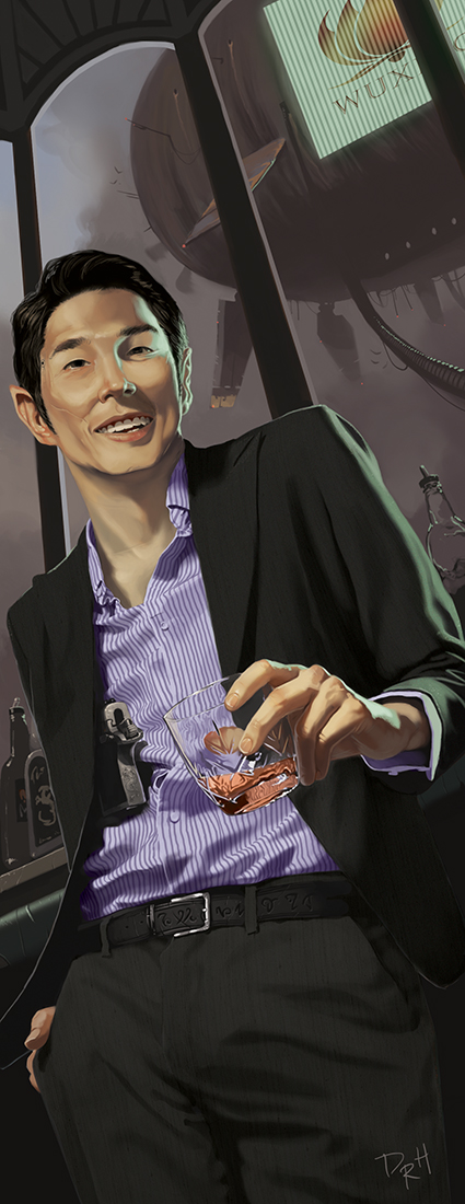
I don't have much to say except I'm published in color now, so... booyah. I just recently finished some stuff I can't show, and I'm really close to finishing some stuff I can, so you'll get to see that all in due time. Until then, feel free to entertain yourself with these pretty pictures from Shadowrun: 5th edition.


Sunday, May 26, 2013

Chase

Fun fact: I've never painted a hover-bike chase. WHY?

Little genre trope tidbits: the good guy is on the right because #1. he just served a plate full of foot to the dude on the left #2. his bike is scrappy and worn (sci fi fans have been taught to be suspicious of anything too smooth and perfect) #3. he's got a cape, which gives him a little personality other than 'random helmet man.' I'd fit a dog in there if I could, just to make sure you knew he was endearing. But a kick to the face will have to do.

Saturday, May 18, 2013

Sparrow

Now I'll sit on her, see if I want to make changes before I send her into the wide, cruel world.

In the mean time, let's talk about her tattoos.

Since I wanted much of her character to be in the tattoos themselves, I tried working with one or two telling motifs. Her right arm starts off with a smoking knife and a banner. The banner says, 'hack' since she's an adept hacker. The skull, snake tail, and bone design moving into the grim reaper all follow the same idea: death. But the Reaper's coat is drawn away, and flowers burst from his ribcage. The verse below that is I Corinthians 15:26 "The last enemy to be destroyed is death."

Her right arm moves from death to life, while her left arm represents resurrection itself, what with spirit birds bursting from the dead sparrow's heart.

I originally wanted a much more cyborg-ish rogue, but I did my research, and adepts, though they have increased physical abilities, don't usually opt for cyborg parts since their abilities don't affect (and in many cases are hampered by) technology. So I had to go all-naturale.

UPDATE: Changes! :)

Tuesday, May 14, 2013

Operation: Look at Me

Welcome to the ground floor. I've been light on projects lately, so I'm starting to get proactive on the situation. I really liked working for Shadowrun. As I've covered in my previous posts, they liked me working for them, too. But like any child who knows that their parents love them, sometimes all they want is some attention.

'Look at me!' They scream, while doing anything on a spectrum from touching their nose with their tongue to climbing a tree while trying to juggle cats. The amount of attention they get is in direct correlation to the danger/impressiveness of their feat.

So I'm going to try and juggle some cats for Shadowrun.

My greatest strength is also my greatest weakness: I am a character artist. The faces/figures are crisp, clear, and individual, but the outfits are poorly thought out, lacking the required baubles and doodads that every post-magical-awakening badass should be fitted with. I struggle with the storytelling, not sure if I should go full leather chaps or 80's glam, and end up dropping a t-shirt and jeans on a bamf elven warrior. Even if they were Express Jeans, I should be doing better.

So I thought about it: I enjoy simple design. I like clarity of expression. But how do I get my cake and eat it? How do I tell a runner's story without chains and netting crisscrossing the frame like an S&M surplus store?

I looked through older (read: already published) Shadowrun illustrations, and I noticed another common theme: tattoos. Most of the tattoos are black tribals, which probably has more to do with their simplicity than a future cultural preference for frat boy tramp stamps. Don't get me wrong, they look cool and all, but for such a personal accouterment, you'd think there'd be more personality.

Which is why I did this sketch:

Meet Sparrow, the elven adept hacker. Adepts are runners that use magic to augment their abilities, rather than cast spells. Sparrow has augmented eyes, reflexes, speed, and stealth.

She also has one more important ingredient, badass-ness. After working on more than six illustrations with Shadowrun, it's the most important ingredient in every piece, and something I have to constantly remind myself of (lest my AD do it for me).

I was influenced by artists like Shawn Barber and Dan Dos Santos, who often let the skin of their subjects carry the narrative.

Now begins the hard part: painting an illustrated woman. I'll invariably have my share of stories on the process, but until then, make sure to introduce yourself. Just... don't make any sudden movements.

Monday, April 29, 2013

Another portrait, another day.

I'm having fun producing these little ditties, and they teach me a little something every time. I really need to loosen up and inject some painterly qualities into my digital work, but at least the likeness isn't bad. Maybe I'll get more adventurous with them soon, but the main goal is to be painting. Goal accomplished.

Saturday, April 20, 2013

Anna and Mother's Syndrome

This is the original image I posted. I was so proud of it not three hours ago:

In science, there is a theory called the happiness theorem. It postulates that if a). woman is x). unhappy, then y). everyone is unhappy. It looks like this:

 x(a)     :(      =      x(y)      D:

I posted the art, I liked the art, I texted Anna proudly, and I received a text back saying only, 'Oh Lord.' And not the 'Oh Lord, thank you for this cornucopia that just fell from the sky,' more the 'Oh Lord, why hast thou seen fit to smite us?'

So I asked her what was wrong, and she said, "Is my nose really that giant and hooked?" And that's when I knew: I had Mother's Syndrome.

Mother's Syndrome is when you love a piece of art, you think it's the most wonderful piece ever, and you show it proudly to all the other parents. 'Look how beautiful she is, listen to how sweetly she sings,' you cry. And all the other parents smile tightly, avert their eyes, and plug their ears.

Some artists never get this. Some artists hate everything they do, which makes me wonder why they do art. I'm the opposite. Every newfangled piece I drool onto the canvas is my baby, and my baby is the BEST BABY IN THE WORLD.

It isn't always a lost cause, though. Most times, I've just stopped a few hours short, or failed put things together in enough places to throw it off. So I gave Anna the usual artist lingo for 'Yeah I effed up,' which is 'I meant to do that.' And, as per usual, I got over my motherly pride and fixed the darn thing.

So here's the update. Is it better? See for yourself. Is it done? Well, we all know what happened last time I said that. Rock-a-by baaaby in the tree top.....


P.S. Anna was very gracious, never once criticizing my work. The conversation above is edited for humorous purposes, and does not represent her humble and sensitive nature.

P.P.S If you scroll from one picture to the next and back again in rapid succession, it looks like she's bobbing her head and laughing.

Thursday, March 14, 2013

Shadowrun: Stormfront, Lesson 4

And now it is crunch time. I've produced three illustrations, I've learned plenty of lessons, but now I have little time for the last illustration. It was supposed to be about five magic users in a basement who delve into dark magic with deadly results. There's a bang! A nearby shadowrunner rushes to see what is wrong, his hands up to defend. A few weeks earlier, I had sent my AD this sketch:


I thought it was kind of cool, but I was unprepared for how not cool it was: I'm showing only people's backs, the perspective is truncated, and the illustration should be about the aftermath not the explosion. I had to start over. But instead of redrawing way back then, I started on the other projects. Fast forward three weeks: now I had two days, no thumbnail, and no direction. I hastily scribbled this and sent it away: How does this look?


I get nothing back.

One of the reoccurring issues I have is the definition of thumbnail. My AD wants to see basically the finished piece minus the detail and extra busy work. On my end, I'm throwing out mind pictures. They're like dreams. The space is undefined, the characters are vague, but the feel is there.

Since I work realistically, I try to get a thumbnail approved, then I take reference of models (me, most times) in the various poses, and then I fill in the thumbnail. Sometimes I find that what looked good in my head simply doesn't work physically in real life, and so the composition has to change to accomodate. Many times I've sent in a thumbnail and get critiques on proportions, etc, things that would be ironed out in the final. So it is my responsibility to put in enough effort to get 'most' everything right, so that my AD doesn't have to trust me not to send him a guy with a tiny hand or a scribble face. But this time, I didn't have that luxury.

I wanted to get this piece to him with a full day to spare, so that he could mull it over and send me the final revisions. That meant, since it was due on Thursday, that at 10 in the morning on Tuesday I had 24 hours to shoot reference and finish an illustration. I knew there was probably just a little bit of panic on his end, seeing the scribbles I sent him, but I drove forward anyways.

I sent a goodbye to my friends on Facebook, taped my living will to the door, and dove in, shooting reference, cobbling it together, changing the composition as I needed on the fly. I drank coffee, guzzled water, and took breaks every two or three hours to stretch and pretend that everything was okay. Sure enough, 20 hours later, I sent him this:

He loved it. I really liked it, too. It showed me that I could take what was a weak illustration and turn it into a strong one. It also showed me what I was capable of come crunch time. It also told me that I didn't want to repeat this performance. But it took less than two months before I not only repeated this performance, I trumped it with double the time. That's a story for another day.

Until then, thanks for reading, and join me next time on David's Journey's in Professional Illustration: How to find the ladder to succes, and what to do with the rungs when you're on it.

Shadowrun: Stormfront Lesson 3

This piece went smoothly as well. I figured out what I really needed early on with this piece, and that was a detailed thumbnail. Again, this is something they teach you in college, that the more time you spend on the foundation, the better your final will be, but for some reason I either forgot or chose to act smarter than my teachings. Regardless, this time I made sure to nail it down.
Here we have a Shadowrun secret agent in camouflage, sending information on troop movements in the forest. I was asked to fix just a few things, like size and distance, just so that she didn't look huge and she still looked hidden. Then I worked on the final.

I showed this piece to my friend who is in the army. He took a few minutes to take it in, nodded sagely, and said nothing. "What?" I said.

"Well, she's wearing a ghillie suit, but her head is uncovered!" he said, trying not to hurt my feelings.

But this is another one of those 'illustration as stage play' moments. The viewer doesn't want to see some anonymous fur suit sitting on a log, they want to see a real person, they want to see her reaction to the soldiers, how she's feeling. As my AD said when I asked what he liked about the piece: "the hot spy chick in the trees sold me!"

Final note: the girl I used as a model saw this painting and gasped. She said, "David, now I really want snake bites!" To her I say, do you really want to be a secret agent deep in the forest wearing a ghillie suit, too? I know I do.

Shadowrun: Stormfront, Lesson 2


Welcome to Lesson No. 2 out of 4 in my series on what I learned during the trials and tribulations of my recent commission. This lesson, oddly, is that sometimes you just got it right. Remember last time, when I learned not to show the character's backs to the viewer? Well, as Missy Elliot says, sometimes you gotta flip it and reverse it.

David! There's nothing but backs, here! You fell into the trap you just figured out how to climb out of! The key here, just as it was last time, is focus. I needed to have the priest as the focus, so he became a larger part of the whole. Here, I'm doing an illustration on 'some soldiers' using giant bug spirit monsters as target practice. Since the focus is the bugs, it becomes more about what the soldiers are doing, and less about who they are as individuals.

My AD loved this one from the get-go, and just told me to execute the finish (no pun intended). So here goes:

I think this one turned out to be his favorite, and it is one of my favorites, too. Atmospheric touches, like the sunlight glaring on the second shooter's hands and the sandy middle ground, as well as all the gross little details on the monsters, really came together almost effortlessly on this one. I wish every project were so easy. But then, we'd all be artists if this stuff were easy. Not to mention, I have no time to slow down! Two more to go, and I've already spent more time than I thought I would on these!

Stormfront: More Lessons to Learn

Another one of the books I worked on is available for purchase! I was asked to produce four(!) paintings for Shadowrun: Stormfront. You can see all the details here.

Each painting was a special sort of learning experience. So, over the next week, I'll take you on a journey fraught with ignorance and adventure, if adventure is defined as sitting at your computer.


Shadowrunners find sanctuary in Bogota. Oddly enough, this piece was one of the ones with the least amount of changes made to the thumbnail, but it still had a long way to go.

First, mentioned my AD, I was showing all of their backs. Second, the priest was supposed to be a badass, but not an aggressive one. Here, it looks like he just busted up a birthday party with his lack of remorse and a semi-automatic weapon. Finally, when this illustration goes to print, it will be 5.5x8. By giving so much space to the background, I have limited the focus on the characters, especially the priest, who is the real star of the painting.

So I pulled in the focus and redesigned the priest:


With the go-ahead, I got busy on the final. This is, in my opinion, the weakest of the bunch. That really comes down to being lazy with the thumbnail and not redesigning it when I had the chance. It still got the message across, and there are plenty of things I like about it: the shadow of the stained glass on the pillar, the textures of their various suits in the darkness, and the feeling of dimension in the architecture of the church.


The most important lesson (that I probably knew from college and promptly threw away) was that these illustrations are like a stage play: the audience needs to see the characters and be the center of the action, even if you have to fudge it. But, no time to reflect! I have three more paintings to do!

Friday, January 4, 2013

More in 'that style'

I love painting. I love the painterly style. But it isn't for everything. Which is why, if you've been following my work lately, you've seen a different type of art coming out of me. My website will soon have four pages with different galleries on them: Fantasy illustrations, black and white illustrations, fine art, and editorial illustrations. This is one of many in a more editorial style that I am working on, so as to be more marketable. Don't worry, I haven't given up on painting, and, if you must know, I have at least five pieces to show you as soon as I'm allowed. But until further notice, here is the line art for what I will eventually color in and experiment with. Bonus points if you know who they are.

Gold.

Just a quick color-up. Andy Warhol would be proud.

Wednesday, November 7, 2012

"It was a Pleasure to Burn"

Here it is so far! I always say 'so far,' because I seem to tweak things right at the end every time. Regardless, this piece finally has that cooked feeling. Let me know what you think!
I might as well elaborate on the image.

This illustration is based on the book Fahrenheit 451 by Ray Bradbury. The book's protagonist, Guy Montag, is pictured at the left. He is a fireman in the future. Everything in the future is fireproof, so firemen make fires, and they burn books. Clarisse, pictured on the right, is a young girl he meets from the neighborhood. She opens his eyes to the world he was missing, and from that moment a fire starts in his soul that threatens to destroy his artificial world.

I wanted to portray the ignition of his imagination here. A much more symbolic painting than I have done in a long time, but I like it. I was going for two things here: Mood and subtlety. I wanted it to look like a dreary evening fog that Clarisse's ebullience directly contradicted. I also wanted there to be a fight between organic and industrial between the sharp wrought-iron fence, slick leather glove, the twisted tree and soft dress folds.

I think there are still small things I need to balance on the piece, but, as is my usual pattern, I will set her aside to garner critiques and cool down so I can look at it with fresh eyes. Enjoy!

Friday, August 26, 2011

Decision time!

I have two digital comps that will help me decide where to take my painting next. They are fairly good looking on their own, though, so I thought I would offer the illusion of choice. Which is to say, I've made up my mind, but I'd like to see what you guys think. Should I paint A?:


Should I finish it out in the style of B?:


Or really make it the best painting EVAR with C?:


Or my own fanboy creation?

Wednesday, December 3, 2008

Troy, almost finished.

Yeah, you get it. I'm busy, so, uh... type at you later.

Tuesday, November 18, 2008

Past Projects 1

This is the first piece I did this fall. A cover for The Scarlet Letter, o' course. Not the most lively story, mind you. So I found it difficult to get a really exciting moment to illustrate. The climactic end speech really wouldn't do. Spoilers on the cover? Taboo, good sir! 

Thankfully the very first scene in the book does much the same thing, setting poor Hester on a pedestal in the middle of the town square amidst angry lookers-on. I wanted an epic-ness to this tale of hidden sin and evil deeds. Puritans really resist being made epic, though. 

It's about 24"x32", oil on canvas board.