It began as something simple: Just a little unit management game where you draw paths for specific sprites to follow to specific destinations. We settled on vikings (the original concept, I kid you not, was a joke about an entire game where vikings would fart their conversations instead of speaking). So I started painting backgrounds. Will, my coworker, designed and animated the characters.
We didn't really know what the tone of the game would be, so I started from Will's sketch:
Then we decided to have all the units from the top-down perspective:
Finally, just for good measure, another level I painted for the game. Can you imagine this fitting in with the visual style I was trying to develop initially?
We'll be releasing the game within the next week or so. Until then, here's a teaser trailer.
Oh, and I'm still working for Shadowrun. Two of my favorite pieces are set to get published soon, I can't wait to show you. Until then, enjoy this lucky Ork from the recently published Shadowrun: Run and Gun.
Then we decided to have all the units from the top-down perspective:
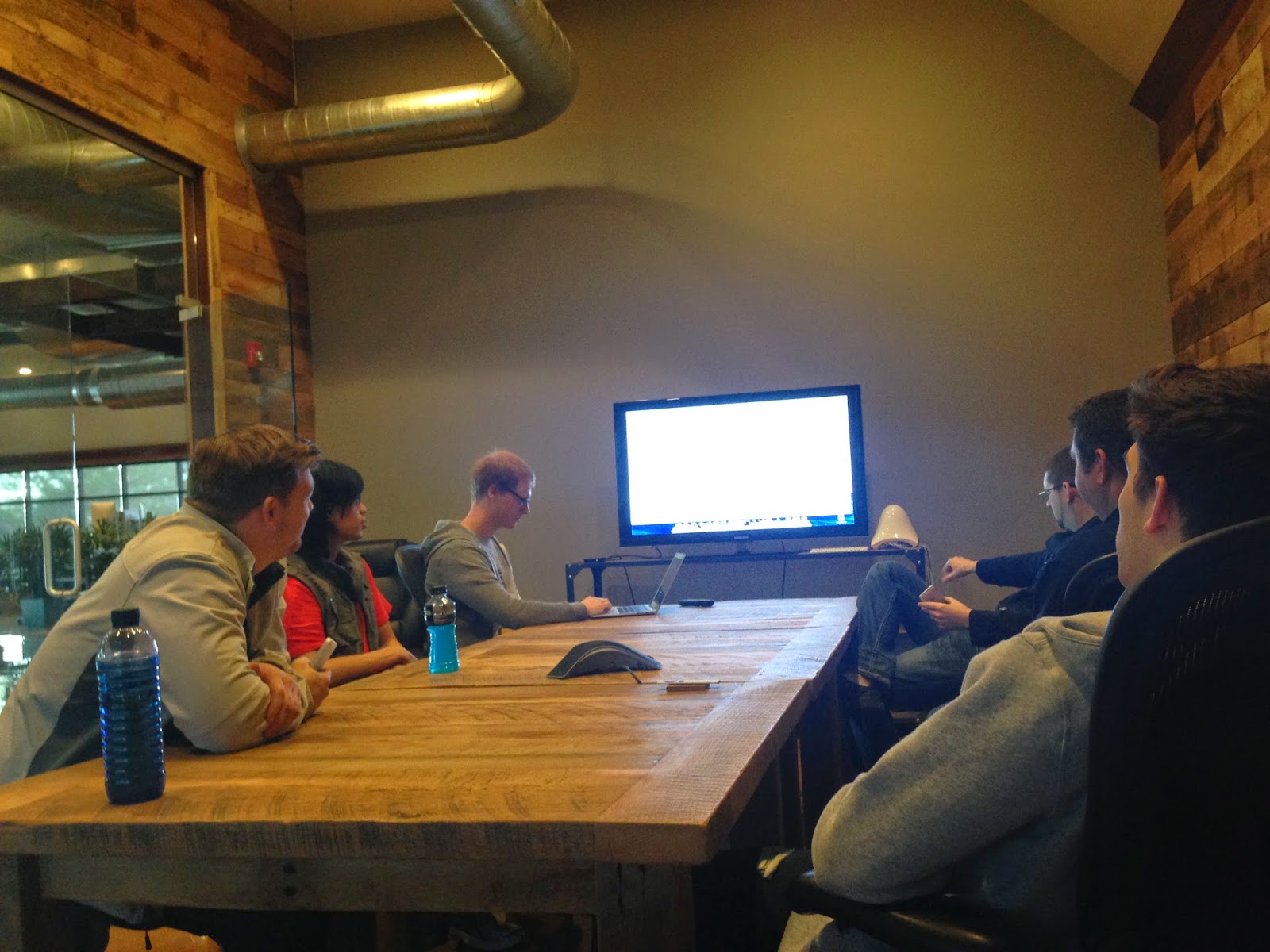
Then, one fateful meeting (that looked a lot like this),
We decided that, instead of each viking going to the barracks and disappearing, we should have each unit restock and head back out to war. Now we had to design an open port so the player could see each unit when it was finished restocking.
I was also trying to go with a more simple design, something clean and brightly colored. But after showing this piece off, my direction was clear: make it war torn, make it dimensional.
Now we were at week four of six expected to finish the project, and I had finished my first background of three. Two more weeks, two more backgrounds. That would have been fine, but that was not all… Each character on these maps had a very cartoony style: flat colors and hard-lined shapes. Everyone liked the new more realistic direction of the background, but now they wanted the characters to fit into it. The characters are cut into pieces so that they can animate. Some characters could have up to fifteen individual parts, and I was the one who was going to paint them.
The game, originally simple levels, ballooned into six levels, each with ten different challenges.
Thankfully, the higher ups decided to pull a few artists off of a different project to help me and Will. Here's a good example of the changes made to the style of the game throughout development. This is just the main menu! Keep in mind that most of these changes where made in the last weeks of development time:
Finally, just for good measure, another level I painted for the game. Can you imagine this fitting in with the visual style I was trying to develop initially?
We'll be releasing the game within the next week or so. Until then, here's a teaser trailer.
Oh, and I'm still working for Shadowrun. Two of my favorite pieces are set to get published soon, I can't wait to show you. Until then, enjoy this lucky Ork from the recently published Shadowrun: Run and Gun.


1 comment:
Man! Looks like things are going well for you. Your art is getting better and better man, kudos!
Post a Comment